Dramatically changed Icons in newest v3.34-beta.6 - What do you think?

Since the version Mp3tag v3.34-beta6 the Toolbar icons seems to be dramatically changed:
Unselected Track
NEW-unselected Tracks

Selected Track
NEW-selected Tracks

--->

These are the same icons in Mp3tag v3.34-beta4:
Unselected Track
OLD-unselected Tracks

Selected Track
OLD-selected Tracks

Here's my very personal opinion of the new icons:
Sorry, but I don't like them at all.

The new toolbar icons are difficult to distinguish, largely because they’ve lost most of their color accents and now appear extremely flat. This makes them blend into each other visually and reduces their usability, especially in workflows where quick recognition is essential. A bit more contrast, depth, and color differentiation would go a long way toward restoring clarity and improving the overall user experience.

It would be great if there were an option to choose whether to display the "old" or the "new" icons in future versions.

What about other opinions?

3 Likes

Hello @LyricsLover,

To be honest, I tried the new icons, but I had trouble getting used to them, and I don't like them either...

Thanks, LyricsLover, for starting a discussion about this; I wouldn't have had the courage to do it myself...

I was thinking the same thing; it seems good to have the option to keep the old icons, which would be my personal choice, because the old icons are more visible on the screen than the new ones...

If we could keep the old icons, I might be wrong, but I think the new command, "Appearance - User Interface Scaling," should be blocked for the old icons. I don't think they would adapt well to the screen...

What do you think, dear Mp3tag members?

1 Like

Well I don't like this icons either but I am not using Icons extensively.

I grew up with software and SAA interfaces in a time before icons existed. That's why I only use about a third of the available icons in Mp3tag, even though I've used it extensively for over 16 years.

Therefore, I don't consider myself an icon expert.

I quite like it! It’s a good direction to take, the icons are all well-balanced which is hard for UI design to always get right and it’s very faithful to the originals. I held my breath for an icon re-design though I didn’t expect it to be completely new ones.

I do still have a soft spot for the old classic pseudo-skeuomorphism. If it’s still possible to have the classic ones with properly upscaled versions as an optional theme, I think it would make a lot of people happy (myself included).

It might help with clarity if there was an option for filled icons so I made a mock-up just to compare. I’m seeing mixed results though, maybe thicker single-lined icons like Remove Tag/Undo/Redo/Refresh could help too:

filled mockup


Just a couple of observations for improvements:

125% taskbar looks iffy, might need an extra lot of icons made for that scale.


Dark mode also seems to suffer from bad anti-aliasing:

I’m on 1600x900 Windows 10 so I don’t know if any higher/lower resolutions are also affected.

2 Likes

4 Images by @LyricsLover

Mp3tag v3.34-beta4
dbc77f547d355b13c96c9d93d22322b8abbed0f6_2_690x37
9fa1c7a2d7fa29173b8e5e63d34affd2108915b5_2_690x37

Mp3tag v3.34-beta6
358b80bd2ccc66be92c0cac66bef2f3a9bb39645_2_690x37
e024e6bda908c3221059539b6b30bc7c6c720dd9_2_690x37

Mock-up created by @arb

9ac5ad268aaf69e362d14cd137c073e6fc97a575_2_689x59

Thanks @poster for your comment…

Dear members, I just wanted to clarify my first comment. I'd like an option in Mp3tag to allow users to keep both the old and new icons, for those who are interested…

Thanks @arb, I like the icon mockup you created. It's true that I'd prefer to keep the old ones; having this kind of icon, which you gave us as an example, would be a good compromise, in my opinion.

arb, I agree with you. Thicker icons, with a single line, like Delete Label/Cancel/Reset/Refresh, could also be useful.

I think it would make our work easier with these kinds of thicker icons…

1 Like

While I appreciate Florian's work on the icons, my advice to users is to learn the common keyboard shortcuts. Mp3tag has a great many of these.

For me, the Mp3tag icons (new or old) are limited and too tiny, while the keyboard shortcuts are extensive and easy to read. I know that old habits die hard, but please try using just keyboard shortcuts in Mp3tag for a week....

I do have an application where I use toolbar icons extensively. I can do that because the icons are large enough to contain enough detail as to often make their function clear without looking at the icon label. In this app I can even create custom icons to populate new, moveable icon bars. Here is a portion of a standard icon bar at 100% on a 1280 x 1024 monitor:

UniversalSmarticonBar

You say "Tell us, oh wise man, what wondrous application can do all this?" It's Lotus Word Pro, an application whose look and interface was designed in the late 1980's. For most people, such large icons would take up too much screen area in Mp3tag.

I guess the new icons are because otherwise it is difficult to support variable scaling. I don't want to put any weight on the scale as i don't use the windows version. But my opinion is that the old icons feel very windows 3.1/95. The newer icons are certainly fresher, and adding colors like in arb's suggestion seem like a middle-ground, or more varied accents on the icons. If you have a certain "heavy" or "fast" workflow, learning the keyboard shortcuts is the way (at least if you still appreciate your arms and hands) instead of mousing around.

The icons on the Mac version could also add some accent colors here and there, because it is completely monotonic flat.

Hello @Doug_Mackie,
I think Florian is doing an excellent job with Mp3tag. I really like it when he adds new commands; it's great, I haven't seen that in other tagging programs...

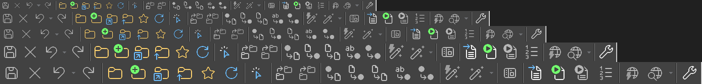
As for the icons, as you said, it's hard to break old habits...

@AreDigg says:

But my opinion is that the old icons feel very windows 3.1/95. The newer icons are certainly fresher, and adding colors like in arb's suggestion seem like a middle-ground, or more varied accents on the icons.

I think AreDigg is right about the old icons feeling very Windows 3.1/95.

That might explain our attachment to those icons...

In 2000, the great program Mp3tag was born, and Windows 98 was replaced in 2000 by Windows 2000.

I think some of us like those icons in Mp3tag because they were there, I believe, from the very beginning of the program. For me, the icons are part of the history of Mp3tag...

For the past few years, I've always worked with these icons at 125% size, which I find fine. I know where my frequently used icons are.

I installed the new version to test it on two computers, and I often have to search for or click on the right icon, especially towards the middle of the icon list...

Speaking for myself, I don't really like working with keyboard shortcuts, but Mp3tag allows us to do so much more efficiently. to work with the mouse...

@Doug_Mackie, I found your writing very interesting:

"Tell us, Oh wise man" :wink:, you showed us a toolbar, you can even create custom icons with the application you call wonderful, which can do all that?" It's Lotus Word Pro...

That piqued my curiosity. Is it possible for you to program your icons for your personal needs with Mp3tag?

I have a program project, which should be released before this summer for us radio programmers, that will be 100% compatible with our tags using Mp3tag. I also had a programmer design a ToolsBar specifically for Mp3tag, which allows us to click on the first 10 Mp3tag tools with the mouse. It's very quick to use.

(It's faster than using the invisible toolbar on the screen. To use it, you have to select one or more audio files in the right-hand column, right-click, then choose "Tools," and finally select the appropriate tool.)

Thanks @LyricsLover who started this discussion, and to all of you who participated. I believe your ideas and opinions have been invaluable in advancing our thinking about the new icons...

Mp3tag v3_34-beta4 Icons (old) & ToolsBar Sergius

I have never read of anyone doing this. But I am not the one to ask because I don't want or need to use icons with Mp3tag.

UPDATE: After thinking over your question, I can give you a better answer:

I could create an icon in Word Pro that will run a Lotusscript that runs Mp3tag via its command line. But Mp3tag's command line parameters are very limited and do not include tag editing. So this icon would not be very useful.

Hello @Doug_Mackie,

I understand that you like keyboard shortcuts, as you mentioned in your first message above.

From your links, I was very surprised to learn that it works with Windows 11.

(The last version of Word Pro was 9.8 Fixpack 6 from 2007, which users say is compatible with all versions of Windows from Windows 95 to Windows 11.)

Thank you for sharing your experience with the icons in Lotus Word Pro. I wasn't familiar with this program, and I found your experience very interesting.

You are quite welcome, Sergius!

Word Pro is an amazing program and I use it every day. It could well have become the standard word processor except for one thing. In the early days of Windows, Microsoft began including MS Word for free. IBM/Lotus sued Microsoft to stop this practice but lost the case. Even though by most measures Word Pro was a better program, its sales could not compete with MS Word being given away with Windows.

It's a shame, @Doug_Mackie, because Lotus Word Pro really seemed ahead of its time. If IBM/Lotus had won their court case against Windows and Microsoft, I imagine that program would be the standard today, in my opinion, with innovative features...

Dramatically changed Icons in newest v3.34-beta.6 - What do you think?

Honestly I am fine with the new icons, especially if they make it easier to scale both the interface and toolbar. I was also fine with the old icons, and would be just as happy with a belnd of the new and the colour palet of the old.

I know many people don't like change, but considering mp3tag is more than a quarter century old now (!) I think we can all accept this change if it supports the other improvements.

1 Like

First of all, thanks for expressing your fondness for the previous icons. So far, I've only heard from users who find them outdated, not scaling very well, looking bad in dark mode, or looking like they're straight from the last century. So it's nice to hear that some of you like them!

When I released the last beta that included this change, I was already working on making the toolbar customizable. However, I wanted to get the UI scaling feature and the new icons out the door once that was finished, mainly because toolbar customization is a big mountain of work, and it's hard to predict how much longer it will take. I also wanted to get the extra beta time for the scaling feature. Right now, I'm working day in and day out on toolbar customization (with a bit of support work here and there), and it's one rabbit hole after another.

Part of the toolbar customization is allowing custom icons, so it will be possible (based on my current planning (you know how hesitant I am with ETAs and feature promises)) to also use the previous icons. I'll see how easy I can make it to switch the current icons and support the previous version of the icons as an alternative.

While I don't plan to rework the new icons again, I do plan to address the scaling issues mentioned by @arb (Thanks!). I only have a limited set of testing devices, screens, and resolutions, so I couldn't catch everything. It seems that icons really don't like to be scaled, so I'm trying to stick to the supported sizes as I revisit this.

Thanks also to everyone who likes the new icons, or likes both versions. Your feedback makes all these improvements feel like they're actually worth the effort.

Change is hard, I hope you can bear with the new icons until the next beta.

5 Likes

I agree with you and all the others who prefer the “old” icons as well as I support the posibility to choose myself to use the old or the new ones.

1 Like

I've made it very easy and added a configuration option to switch back to the Original icons via Options → Appearance → Icons with v3.34-beta.7.

I've also created higher resolution versions of the original icons to allow for good quality when toolbar scaling or UI scaling is active.

The scaling artifacts mentioned above should also be addressed with this version, if not, please let me know (preferable in a separate topic).

6 Likes

The new appearance option is just GREAT! Thank you very much for giving us this choice!

The new, higher-resolution versions of the original icons look great and are much appreciated.

image
image

:+1:

3 Likes

THANKS SOOOOOOOOOOOOOOO MUCH :sweat_smile:

1 Like

Ooooooohh, they look so good. :drooling_face:

I've left some separate bug reports but happy to report the 125% is sorted!

25%-scales

And not as a nit-pick but I see there's some very slight updates to the Original icons, good ones though and was honestly to be expected. I'm sure the purists will have fun getting those back when custom toolbar icons comes around :face_with_tongue::

versions

It looks less reliant on Windows XP's style - especially with the folder designs - and closer to Mp3tag's actual icon. I might miss the wee web sources globe but it does now look standardised to the representation of a global "world wide web" network.

Come to think of it, allowing custom icons per web source/action would be immensely cool. :nerd_face:

2 Likes