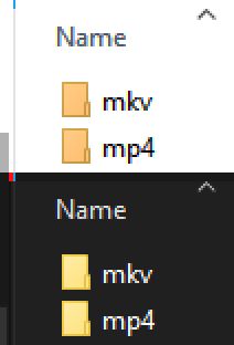
I would like to report a visual bug regarding the file list rendering when Dark Mode is enabled.
Description: In Dark Mode, the file type icons are misaligned, shifting too far to the left and overlapping with the edge of the column or appearing incorrectly positioned relative to the filename. This issue disappears completely when switching back to Light Mode.
Details:
Mp3tag Version: v3.31 (also tested on previous versions like v3.28 with the same result).
OS: Windows 10 22H2 x64
Steps taken: I have already tried a clean reinstallation, resetting the column configuration, and adjusting DPI settings, but the offset persists specifically in Dark Mode.
I am attaching two screenshots for comparison: one showing the glitch in Dark Mode and another showing the correct alignment in Light Mode.
It looks somewhat different on Windows 11. Is this offset intentionally designed or configured to look this way, or is it a rendering bug in the Dark Mode implementation?"
Admittedly, also in my screenshots in the dark mode the icon overwrites the right borderline. But as the icon seems to be darker, it is not so easily visible.
I took screenshots of all the possible Appearance options (except Toolbar scaling which does nothing in this case) and there is a slight difference in Windows 10:
I downloaded Musicbee from the Windows Store which might explain the difference in the lack of a white outline compared to @Varrals ‘s icon.
MediaMonkey was installed non-portable which might shine light on that icon’s slight over-hang over the vertical line. Notepad was pre-installed so same for that.
Just to iterate, it’s not possible to adjust the Column width of the icon display.
Edit: Just noticed there’s an extra line around the border of Mp3Tag’s Column display which is absent in dark mode. That explains the shift but not why certain icons appear larger than others.
That’s a great catch regarding the missing border line in Dark Mode. It seems that when that extra line disappears, the program fails to recalculate the icon’s position, leading to that 'shifted' look.
Since we can't manually adjust the width of that specific icon column, it looks like a rendering bug where the UI elements aren't being properly realigned for the Dark theme.
Is this a Windows 10-only issue? I can't reproduce it on either Windows 10 and Windows 11, but would be interested if someone observes this on Windows 11 too.
In the light mode, you see the shadow of the icon which apparently in dark mode overwrites the separating line. But in the light mode, the icon does not overwrite the separating line.
It does not seem to be visible for all associated icons.
For example, the VLC icon does not have a black border around it, but it is very close aligned to the vertical divider line.
Does look better. Without having changed any settings aside from Mp3Tag’s Color Mode:
It’s just by the design choice of any software whether their icon occupies the entire square resolution of an icon's dimensions: compare the foobar2000 icons, the square-er one is an installed program, the rectangular one an app version. That might explain differences in overlap.
There´s definitely OS-level differences with how Windows handles dark mode UI’s that’s likely out of any developer’s control so that's maybe why there's still slight icon shifting. Here's a shot from Windows File Explorer, light mode's been given contrast to help see a similar border line between UI elements with red/blue lines to outline the addition of extra lines likely to help with visibility:
I also have a screen resolution of 1600x900, Mp3Tag and Windows are both set to default 100% scaling settings. Not sure if that’s a consideration, given there's still visual differences between everyone's images.