Hello there. Firstly, thanks for the amazing application.
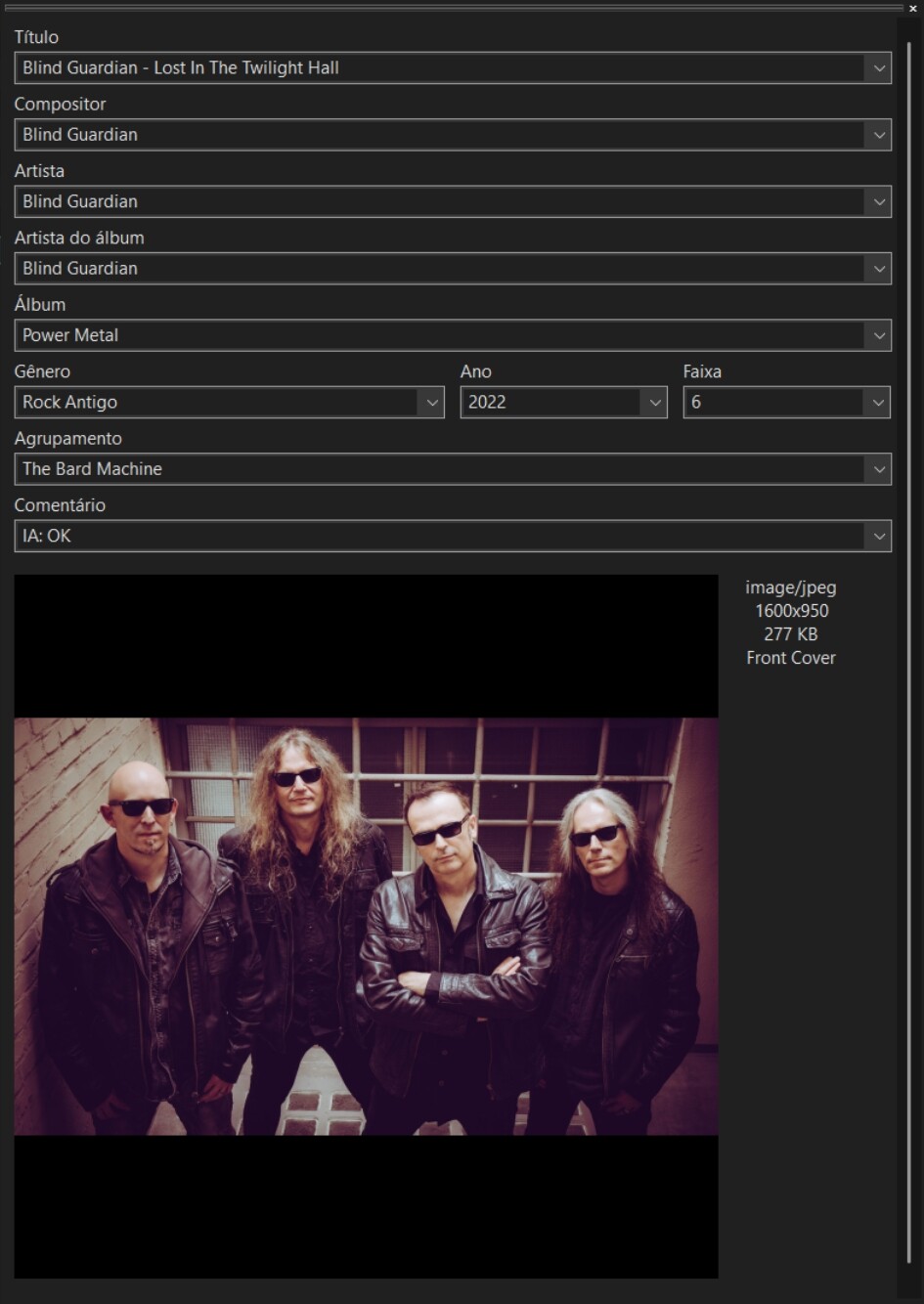
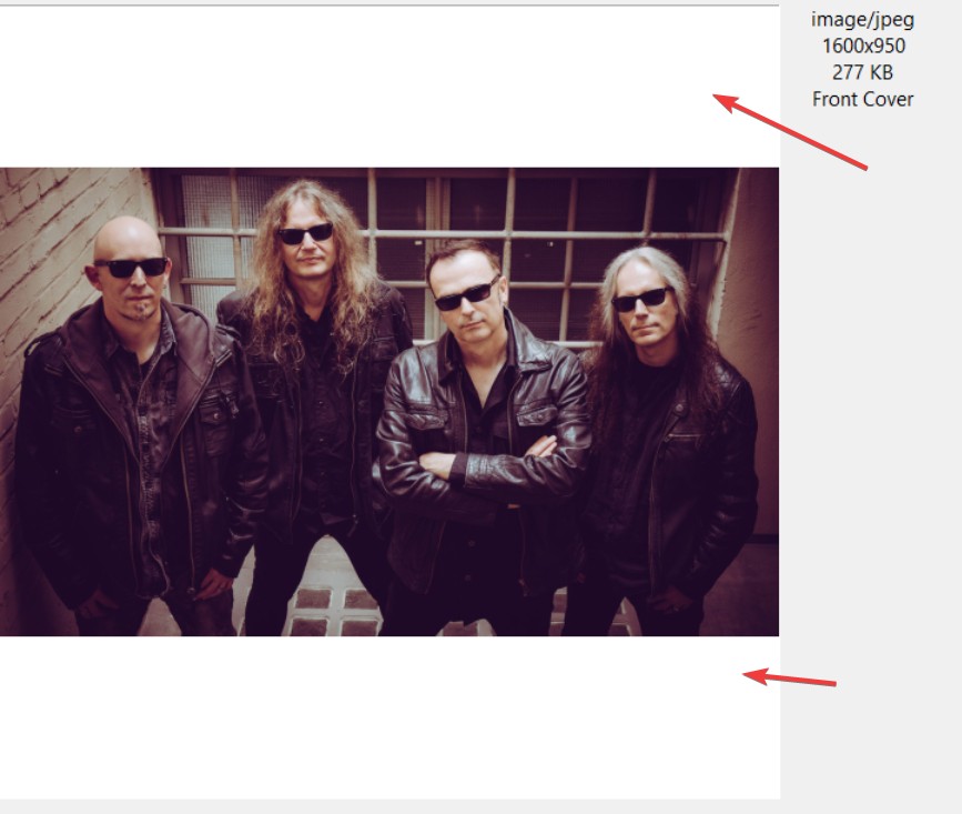
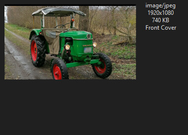
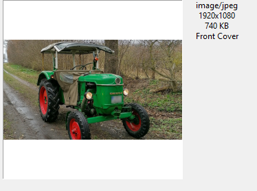
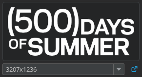
My request is simple: when I select the option to keep the image’s aspect ratio in the preview, I would like those black bars not to appear, or at least to be the same color as the rest of the editing window - “camouflaging” those black edges.
Besides looking nicer, it would also make it easier to spot two issues that the cover art might have:
Black/white borders that the user may not want in the image, but which are currently hidden by the preview.
Whether the applied cover art is truly “long” and not just “square with black bars.” For example: Cover Art generated from a YouTube thumbnail.
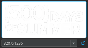
Of course, this issue only appears in cases of rectangular/long cover art, as in the image.
Note: I know there is the option not to keep the aspect ratio, but that distorts the visualization of a long image, making it harder to tell whether the image is actually like that or if it’s just the application’s preview.
AFAIK the background colour is that of the system-wide background colour.
If you want to check (visually) I would either have a look at the dimensions which are display next to the image - they should be almost equal for a real square image - or I would use a filter "$if($neql(%_cover_width%,%_cover_height%),1,0)" IS 1
But this is only the suggestion for the time being until the feature is implemented
Thank you for your reply. That’s a good suggestion, but in my situation the real problem is the black/white borders that are part of the cover art itself, which aren’t clearly visible with the current ‘keep aspect ratio’ behavior.
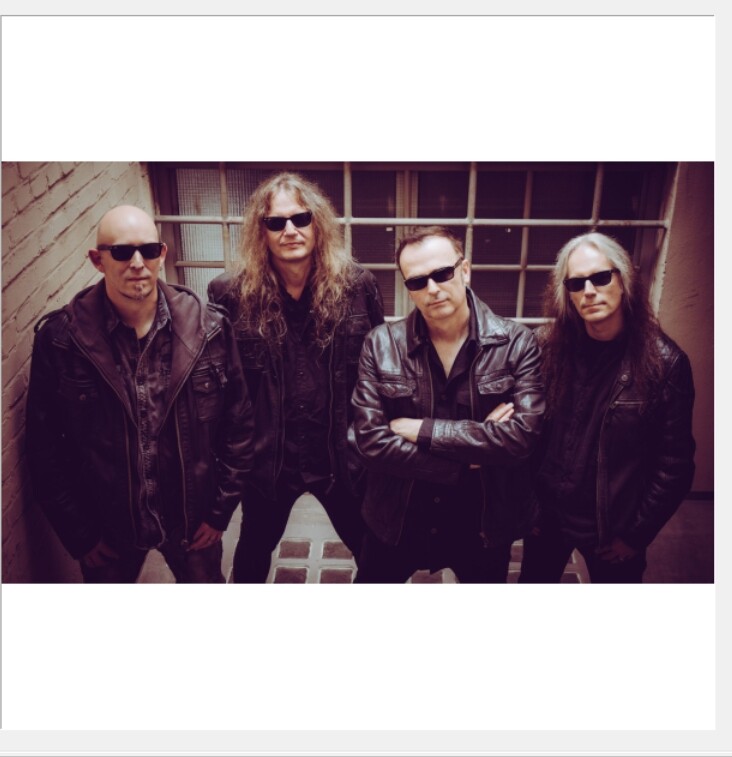
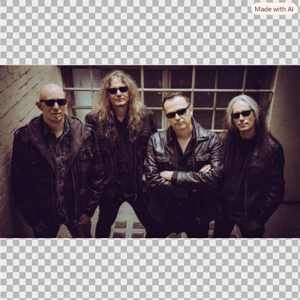
For instance, imagine if the original image already looked like this:
I would supposedly think that the white bars were generated by Mp3tag’s preview, save the tag, and later realize that the image actually had borders when viewed elsewhere, maybe in a player.
There are some square (non-official) covers that have white borders as well, for example: covers of rare old albums. This improvement would also help to notice that during tag editing.
However, there is bound to exist -or will in the future- an album cover with a checkered pattern like that of the transparent background, in which case the original problem would repeat itself (less commonly as in the example of @yurishalk but still....).
IMO a more permanent (and inclusive) solution would be either a user-definable preview window backgorund color selection (which may be an overengineered solution for this issue); or a (presumably) simpler 'Cycle background color' button in the context menu of the preview, and rotate between a few basic solid colors.
Exactly. The only reliable indicator that you see more than the picture really contains or that you get tricked by an exaggerated border around it would be a look at the dimension right next to the display area.
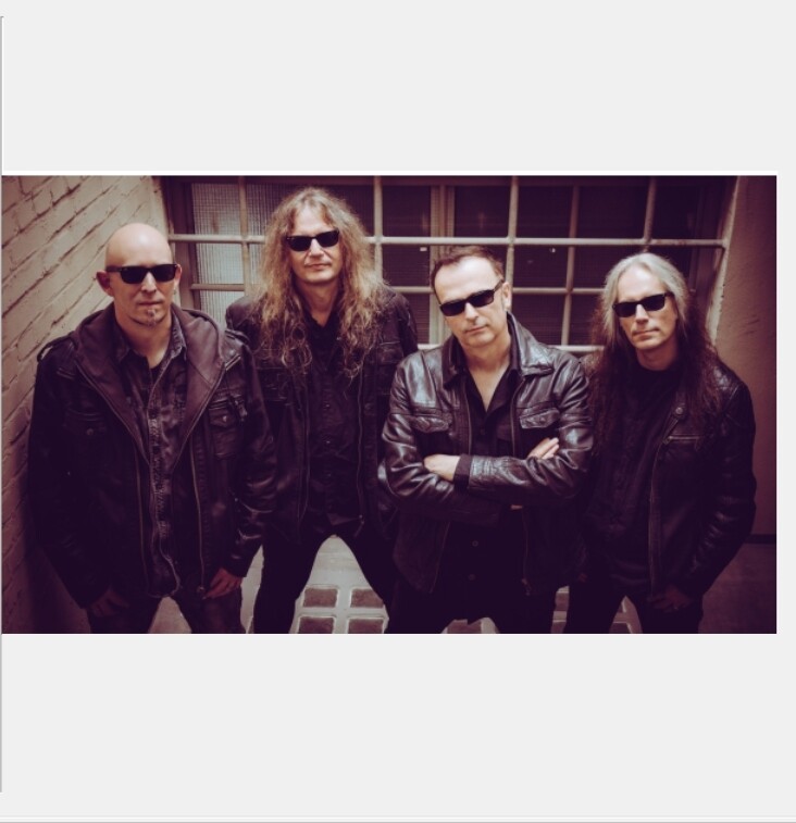
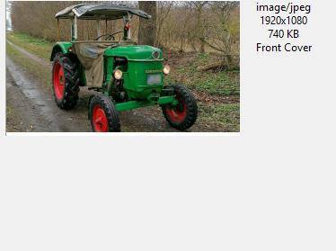
And if something should be changed about the display function, then I would favour a solution that adapts the display object size to the dimensions of the picture so that it never shows any bars around the picture.
E.g. like this for rectangular pictures:
Actually, the longer I think about it - it may be easiest to start every picture in the top left corner - no resizing of the display area required.
And as soon as the colourful part of a picture does not start top left but somewhere in the middle it has decorative elements around it.
But even this suggestion would not avoid a case like the one in the linked thread:
That could only be detected with a look a the dimensions - which brings us more or less back to square one.
I personally like the solution that is used in tinyMediaManager. Since many artwork files for movies/tv shows are either black on a transparent background or white on a transparent background, neither a default black nor white background is satisfactory. A checkered background like @LyricsLover suggested would also look fairly ugly in these cases. Their solution:
Clicking the artwork toggles the background color from the default application background color to white and vice versa. Here's an example:
In my opinion, the best solution would be visualization without any bars. The solution of @ohrenkino solves my issue.
I just need to see the image as it is, without it being squeezed into a square (like when I uncheck the aspect ratio option).
If transparent bars are added like @LyricsLover mentioned, it could indeed happen that the artwork itself has transparent bars (a rare case), but an example would be the fake .png files from Google.